FMP: Week Six
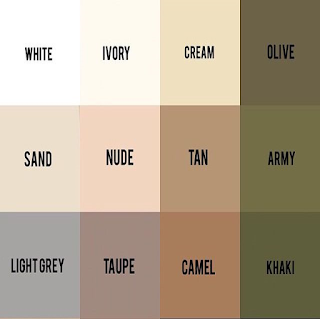
I began this week by considering the aesthetics of my museum, as I wanted my design to fit my target audiences requirements and needs. I was committed to fulfilling and even exceeding their expectations and trying to push creative boundaries. I tried to approach the design of the space in an open and sensitive manor particularly paying attention to small details. As I knew I wanted my museum to have a sense of simplicity and modernism, it was logical to lean towards a neutral colour pallet rather than bright stronger colours. I decided to use white for the exterior which would be matched with natural light to create a welcoming atmosphere and sophisticated look.
Prior to creating any building its important to consider the basic factors such as the design, budget and quality attributes . Evaluating the needs and goals of the structure is also vital before committing to a particular material ;with each one having pros and cons. I knew that there are so many different types of materials out there which are used in creating buildings, making it difficult for me choose. After researching into different possible materials I choose that my actual building would be made out of white concrete due to it being a high -quality material that strengthens over time, meaning it would have be easy to maintain and wouldn't require a repair cost in the future. Its versatility and durability also strengthened it as a choice. I would also use shatterproof glass for my windows that would be fitted in the open triangles found in my design, as its a type of safety glass that has high mechanical strength in comparison to other glass ,therefore would be difficult to damage and would be safe for my visitors.
The materials for my final model would be different to the real life product, as I need to use material that is easy to manipulate. I decided on the use of frosted and transparent PVC for my windows and doors, the key difference is that the frosted one has unmatched clarity and is blurry whereas the transparent one is clear. They are both easy to clean and stick.
I also choose to use plywood(4mm in thickness) that I would spray paint white to represent the white concrete. The reason for this choice is that it would be easy to laser cut and sand down if necessary, in addition to its high impact resistance making it hard to damage. The last material I decided on was artificial grass to suggest greenery in my model as its easy to maintain and has high durability.
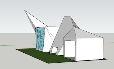
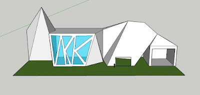
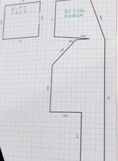
From my previous designs and experimentations I was able to create my final sketch and CAD design showing exactly how I intended my model to look. My aim was to create a innovative modern design influenced by geometric shapes to symbolise structure and order. Little details were later added such as triangular openings for mirror- glass windows which was inspired from the Live House in Moscow, Russia. Having record accurate measurements of my site from DigiMap I was able to now create a floor plan on smart draw using scale and maths. This showed the layout of the building from above including walls and doors. However, I late realised that this wasn't an accurate recording because I had missed out some doors and widows.


Comments
Post a Comment